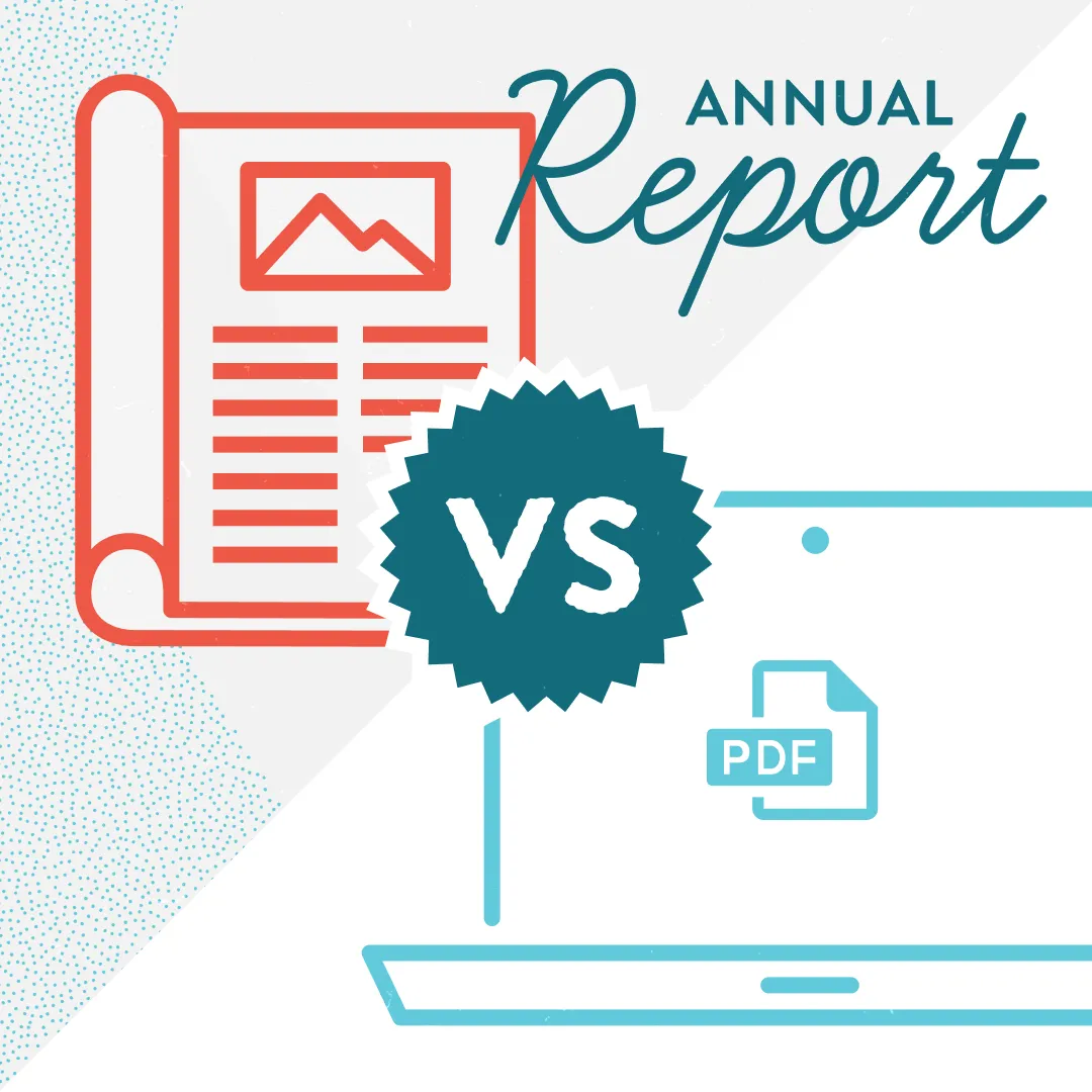


Your annual report landed in your donor's mailbox. They flip it open, scan the first page, and... set it aside. Forever. As a nonprofit marketing manager, you know that feeling in your gut when you suspect your carefully crafted annual report isn't connecting. You poured hours into gathering stories, crunching numbers, and coordinating with your executive director. But if the design doesn't invite people in, none of that matters. After years of working with nonprofits across Wisconsin and beyond, we've seen the same design mistakes tank otherwise excellent annual reports. The good news? They're all fixable. Let's walk through the five most common culprits and exactly how to address them.
Cramming Too Much on a Printed Page (The Death of White Space)
You have so much to say. I get it. You served 3,000 families this year, launched two new programs, expanded into three counties, and your executive director wrote a heartfelt message that really shouldn't be cut. So you shrink the font to 9 points, eliminate the margins, and pack every square inch of the page.
The result? Your donor feels overwhelmed before they read a single word.
In most cases less is more. White space isn't wasted space. It's breathing room. It guides the eye and creates hierarchy. When a page feels cluttered, our brains interpret it as "this will be hard work to read," and we unconsciously disengage.
How to fix it: If it is a print-only document, be ruthless with your content. Your annual report doesn't need to include every single thing you did. Choose the stories and data points that best illustrate your impact. Aim for 40-50% white space on each page. If you're struggling to cut content, consider creating a more detailed impact report, digital version, or blog post as a digital supplement that donors can access online if they want the full story.
A digital annual report gives you the freedom to tell a longer, more detailed story. Just ensure your copy is focused and surrounded by white space.
Using Amateur or Irrelevant Stock Photos
Nothing screams "we didn't try very hard" like a stock photo of generic hands stacking or diverse people high-fiving in an office that clearly isn't yours. Your donors can spot these from a mile away, and they create an immediate disconnect between your organization's authentic work and how you're presenting it.
Even worse is when the stock photos don't actually relate to your mission, like the annual report for a youth mentoring organization that featured a stock image of senior citizens gardening. The disconnect was jarring and undermined the entire section.
How to fix it: Invest in real photography from your programs, even if it means using a staff member's decent smartphone camera rather than hiring a professional. An updated Android or iPhone does a great job. Authentic, slightly imperfect photos of actual clients, volunteers, and program activities will always outperform polished stock imagery.
If you're the photographer, then pay extra attention to the environment where you are taking your photo. Is it cluttered with extra stuff not relevant to the story (e.g., tall, brightly colored Hydro Flask water bottle)? Use a simple background. Make sure it doesn't look like objects are just emerging from the subject's head.
If you absolutely must use stock photos, choose images that feel documentary-style rather than overly staged, and make sure they directly relate to the content on that page. Better yet, reach out to local photography students or enthusiasts who might donate their time to capture your work in action.
Making Financials Confusing or Hard to Find
Here's an uncomfortable truth: many donors flip straight to the financials page. They want to know their money is being used wisely. So when they have to hunt through your report to find financial information, or when they finally locate it only to be confronted with a dense table of numbers with no context, you've created unnecessary friction and doubt.
We've seen organizations bury their financials in the back pages or present them in tiny pie charts with illegible labels. We've also seen the opposite extreme: full pages of accounting line items that would confuse anyone without a finance degree. Neither approach serves your donors.
How to fix it: Place your financial overview in a predictable location—typically the last third of the report. Use clear, simple visualizations like large, well-labeled pie or bar charts that show the big picture: where funding came from and where it went. Break expenses into 4-5 major categories maximum (like program services, fundraising, and administration). Include a one-paragraph narrative that contextualizes the numbers: "85% of every dollar goes directly to programs" is much more meaningful than just showing the pie chart alone. And always include a note about where donors can access your full audited financials if they want more detail.
Inconsistent Fonts, Colors, and Styles
Your annual report uses Garamond for body text on page two, switches to Arial on page five, and somehow Comic Sans appears in a pull quote on page eight. Your brand colors are teal and coral, but this report features purple, three shades of blue, and a mustard yellow that appears nowhere else in your materials.
This happens more often than you'd think, especially when multiple staff members contribute pages or sections. But inconsistency doesn't just look unprofessional—it erodes trust. If you can't maintain consistency in a 12-page document, donors subconsciously wonder what else might be inconsistent in your organization.
How to fix it: Before you start designing, create a simple one-page style guide for the report that specifies exactly which fonts to use and where (typically one font for headings, one for body text, and maybe one accent font for pull quotes), your brand color palette with exact hex codes or CMYK values, and how to style recurring elements like photo captions, statistics, and section headers. Then stick to it religiously.
No Clear Call to Action
Your donor has just finished reading about your incredible impact. They're moved. They're inspired. They're ready to... do what, exactly?
Too many annual reports end with a generic "Thank you for your support" and nothing else. You've just spent 12-20 pages making your case, and then you don't ask for anything. It's like giving a great presentation and leaving before the Q&A.
How to fix it: Include a specific, clear call to action on the final page or inside the back cover. This might be an invitation to renew their support at a specific level or information about planned giving options The key is to give inspired donors an immediate next step while their engagement is high.
Bringing It All Together
Here's the thing about annual report design: it's not about making something pretty (though that helps). It's about removing every possible barrier between your impact and your donor's understanding of that impact. Every design choice should serve that goal.
When you eliminate clutter, use authentic imagery, present financials clearly, maintain visual consistency, and provide a clear next step, you're not just creating a better-looking document. You're creating a more effective fundraising and engagement tool.
Your donors are busy people who have dozens of worthy causes competing for their attention and resources. A well-designed annual report signals that you value their time, that you're professional and trustworthy, and that their investment in your mission is being managed with care and intention.
Start with fixing just one of these five mistakes in your next annual report. I promise you'll see the difference, not just in how the report looks, but in how donors respond to it.